Chapter 1: Introduction to Python for Quantitative Finance

Section 1: Brief Overview of Python in the Finance Sector
Python's rise to prominence in the finance sector is a testament to its versatility and effectiveness. It's favored for various reasons:
- Ease of Learning and Use: Python's syntax is straightforward, making it accessible to professionals without a deep programming background.
- Rich Library Ecosystem: Libraries like Pandas, NumPy, Scipy, Matplotlib, Seaborn, and Plotly offer powerful tools for data analysis, statistical modeling, and visualization.
- Community and Support: A vast community of developers contributes to Python's growth, ensuring continuous improvement and support.
- Integration Capabilities: Python easily integrates with other languages and tools, making it a flexible option in diverse IT environments.
In finance, Python is used for tasks such as market analysis, risk management, portfolio optimization, algorithmic trading, and more.
Section 2: Basic Python Syntax and Concepts
Python's syntax is known for being clear and readable, which is essential for finance professionals who may not have a background in computer science. Let's cover some basics:
Variables and Data Types
In Python, variables are used to store information. Data types include integers, floats (decimal numbers), strings (text), and booleans (True/False).
Control Structures
Control structures in Python, like in other programming languages, include if-else statements and loops (for and while).
Section 3: Introduction to Financial Data Types and Structures
In quantitative finance, data types go beyond the basics. Financial data can include time series, cross-sectional data, panel data, and unstructured data (like news articles or social media posts). Python's flexibility allows for the manipulation and analysis of these diverse data types effectively.
Section 4: Setting Up a Python Environment for Finance
To get started with Python in finance, you need to set up an environment with necessary libraries. The primary libraries include Pandas for data manipulation, NumPy for numerical computations, Seaborn and Plotly for advanced data visualization.
Installing Necessary Packages
Alongside Pandas, NumPy, Seaborn, and Plotly, we will install yfinance, a popular library used to download historical market data from Yahoo Finance.
You can install these packages using pip (Python's package installer). Here’s how you would do it in a Google Colab notebook:
Fetching Data with yfinance
This code fetches the historical data for Apple Inc. (AAPL) for the year 2022 and displays the first few rows. This data includes open, high, low, close prices, and volume.
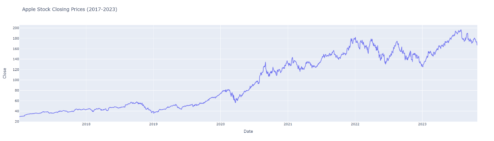
Visualizing Stock Data
Using Plotly, we can create an interactive chart to visualize the stock's closing price over time.
This visualization provides a clear view of the stock's performance over the specified period, demonstrating the power of Python in financial data analysis.
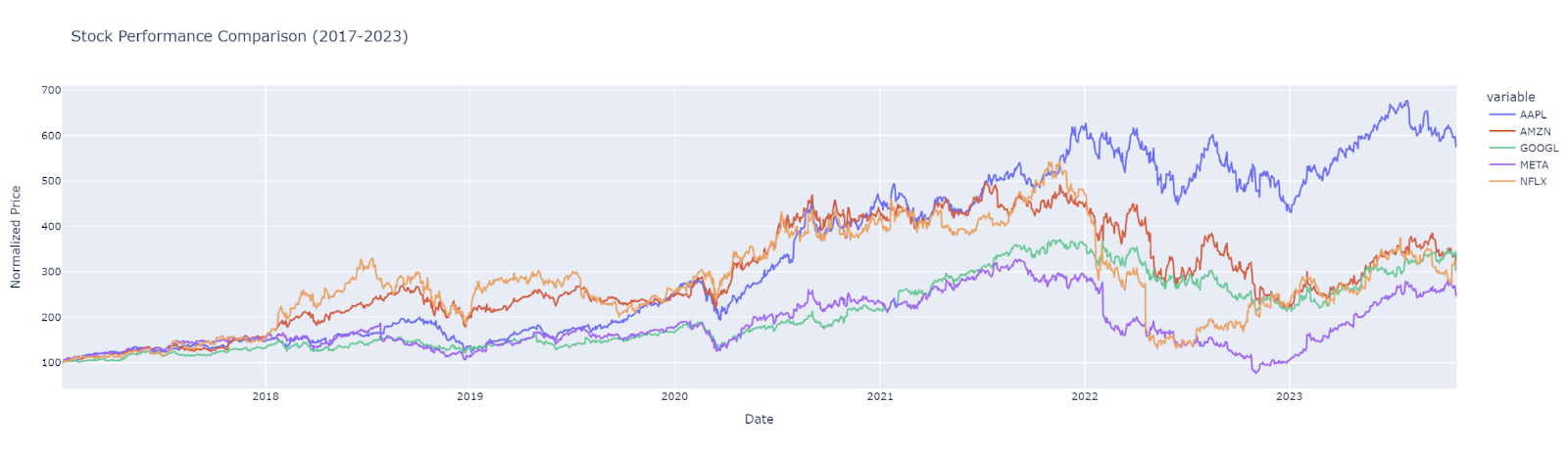
Comparative Analysis of Multiple Stocks
To compare the performance of different stocks, we normalize their starting prices to 100. This approach allows for an apples-to-apples comparison regardless of the actual price differences.
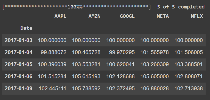
Normalizing Stock Prices
This code normalizes the closing prices of Apple, Microsoft, and Google stocks, setting the initial value to 100 for each stock.
Visualizing Comparative Performance
Using Plotly, we can plot these normalized prices to compare performance:
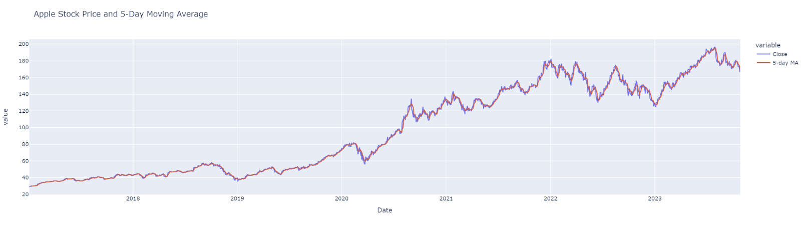
Moving Averages
Moving averages are commonly used to smooth out short-term fluctuations and highlight longer-term trends. Let's calculate and visualize a 5-day moving average for a stock.
Calculating and Plotting a Moving Average
This example demonstrates how to calculate and visualize a moving average, providing insights into the stock's trend.
Volatility Analysis
Volatility is a key measure in finance, often used to gauge the risk associated with a stock. We'll calculate and visualize the rolling standard deviation (a measure of volatility) of stock prices.
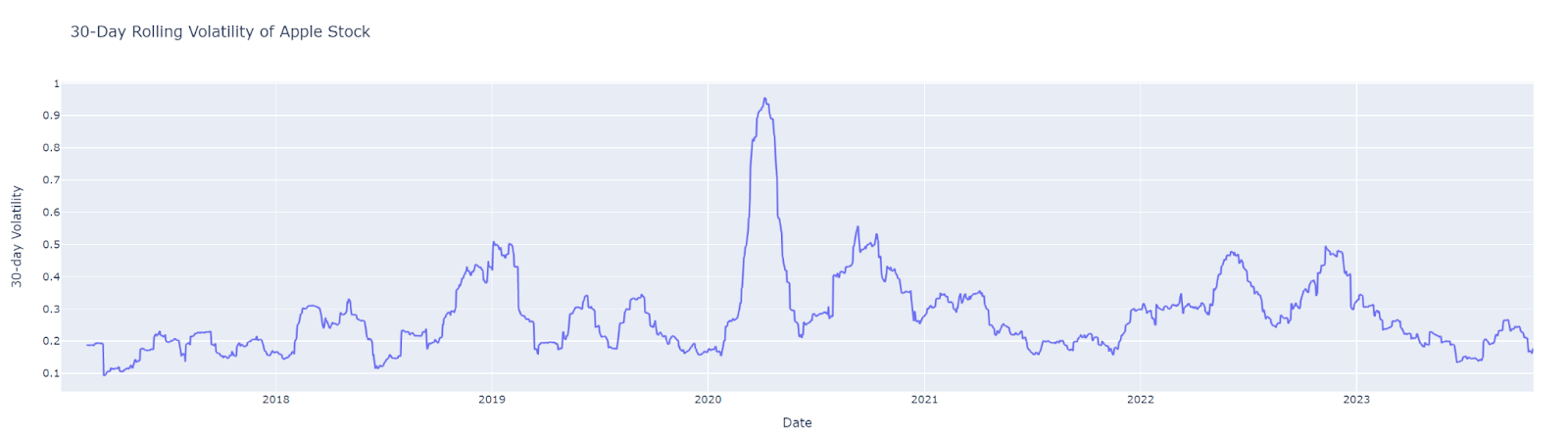
Calculating and Visualizing Volatility
This code computes the 30-day rolling volatility of Apple's stock price and visualizes it. The pct_change() function is used to calculate percentage changes in closing price, which are then used to compute standard deviation.
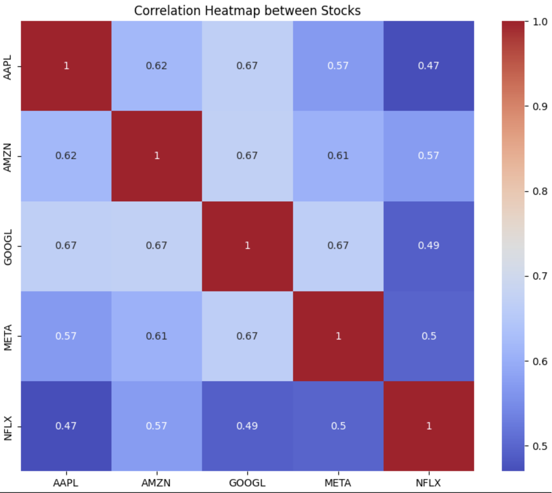
Correlation Heatmap
Understanding how different assets move in relation to each other is crucial in portfolio management. A correlation heatmap can visually represent these relationships.
Generating a Correlation Heatmap
This heatmap of the correlation matrix provides insights into how stock prices of Apple, Microsoft, and Google are correlated.
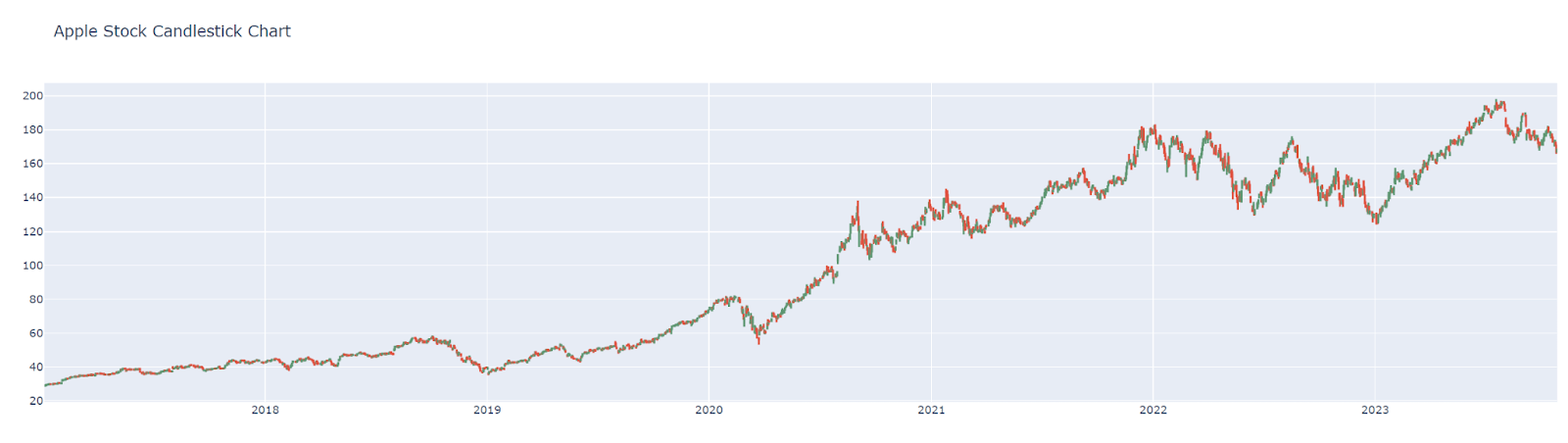
Candlestick Charts
Candlestick charts are a staple in financial analysis, providing detailed information about price movements.
Creating a Candlestick Chart
This candlestick chart for Apple stock offers a detailed view of daily price movements, including open, high, low, and close prices.
Performance Metrics
Performance metrics like Sharpe Ratio, Beta, and Alpha are essential in assessing the performance of stocks or portfolios.
Calculating Performance Metrics
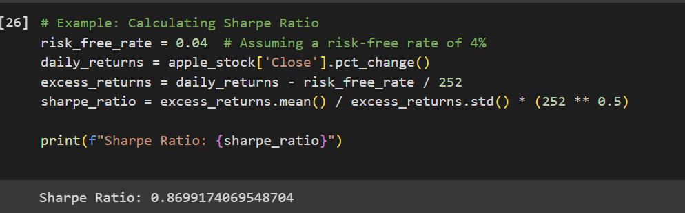
The Sharpe Ratio here is calculated to assess the risk-adjusted return of Apple's stock, considering a hypothetical risk-free rate.
These examples provide a comprehensive view of various advanced financial analyses that can be performed with Python. They demonstrate the language's capability to handle complex financial calculations and visualizations, making it an invaluable tool for anyone in the field of quantitative finance.
![AI Foundational Series - Part 2] Machine Learning vs. Deep Learning vs. AGI](https://images.unsplash.com/photo-1601132359864-c974e79890ac?crop=entropy&cs=tinysrgb&fit=max&fm=jpg&ixid=M3wxMTc3M3wwfDF8c2VhcmNofDJ8fHJvYm90c3xlbnwwfHx8fDE3NDMzNTM3Mzd8MA&ixlib=rb-4.0.3&q=80&w=720)
![AI Foundational Series - Part 1] What Is AI? A Historical and Conceptual Overview](https://images.unsplash.com/photo-1677756119517-756a188d2d94?crop=entropy&cs=tinysrgb&fit=max&fm=jpg&ixid=M3wxMTc3M3wwfDF8c2VhcmNofDZ8fGFpfGVufDB8fHx8MTc0MTQ2Mjc5Mnww&ixlib=rb-4.0.3&q=80&w=720)